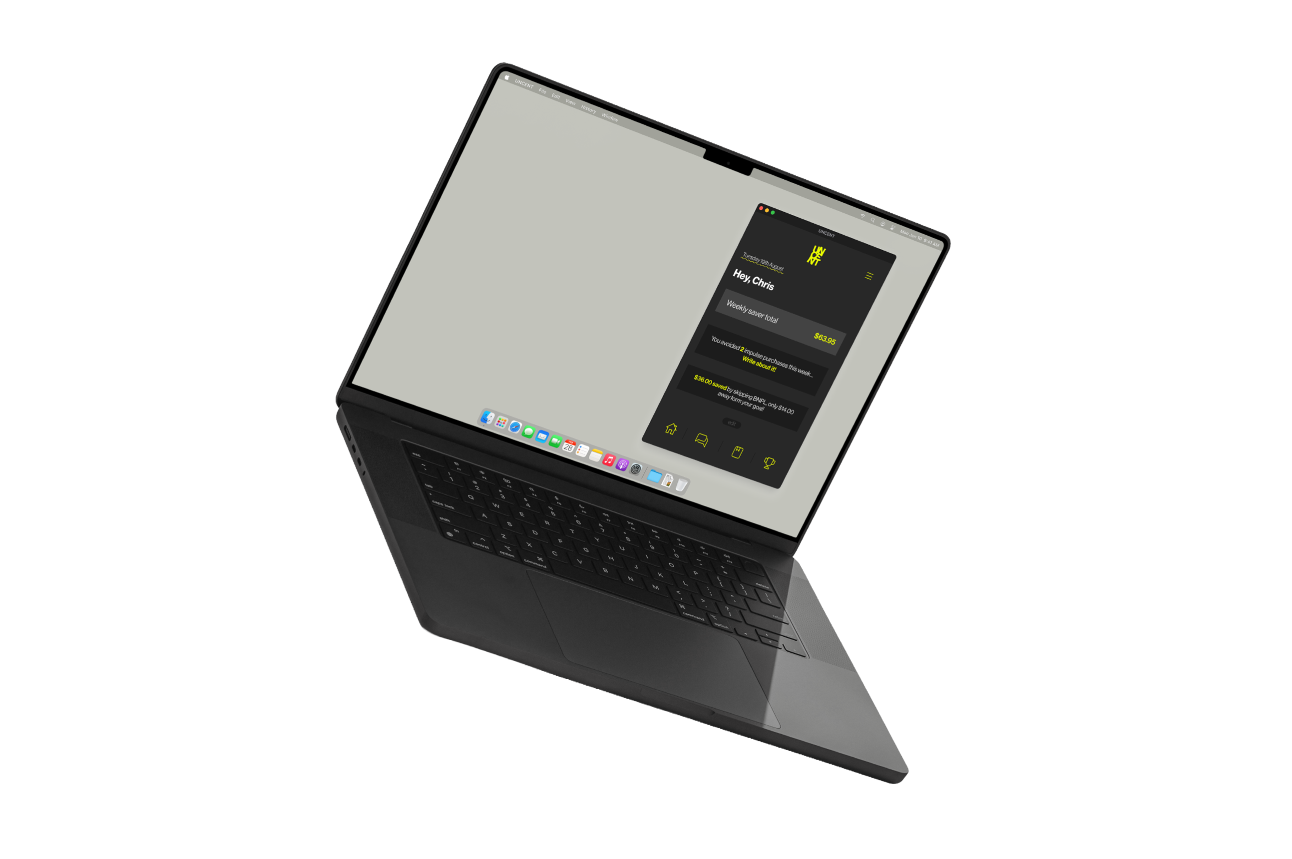

A web-based journaling app designed to help Gen Z build emotional confidence around money.
UNCENT is a reflection tool that helps young adults explore their spending emotions and regain financial confidence, one journal entry at a time. The project started with a simple question: what if money tools felt human?
Through user research we identified three distinct profiles: people trying to feel in control of purchases, people managing emotional spending under pressure, and people balancing creative spending with financial responsibility. Financial stress is constant amongst Gen Z, BNPL platforms quickly become traps, and shame leads to avoidance.
Existing money tools focus on restriction. Gen Z needs reflection.
Gen Z avoids judgement, finds restriction demotivating, and responds better to progress than perfection. The problem was not financial literacy, it was that no tool met them where they actually were emotionally.

Initial wireframes focused on establishing the core journaling flow, keeping the interface as low-friction as possible so users could reflect without feeling pressure to perform.
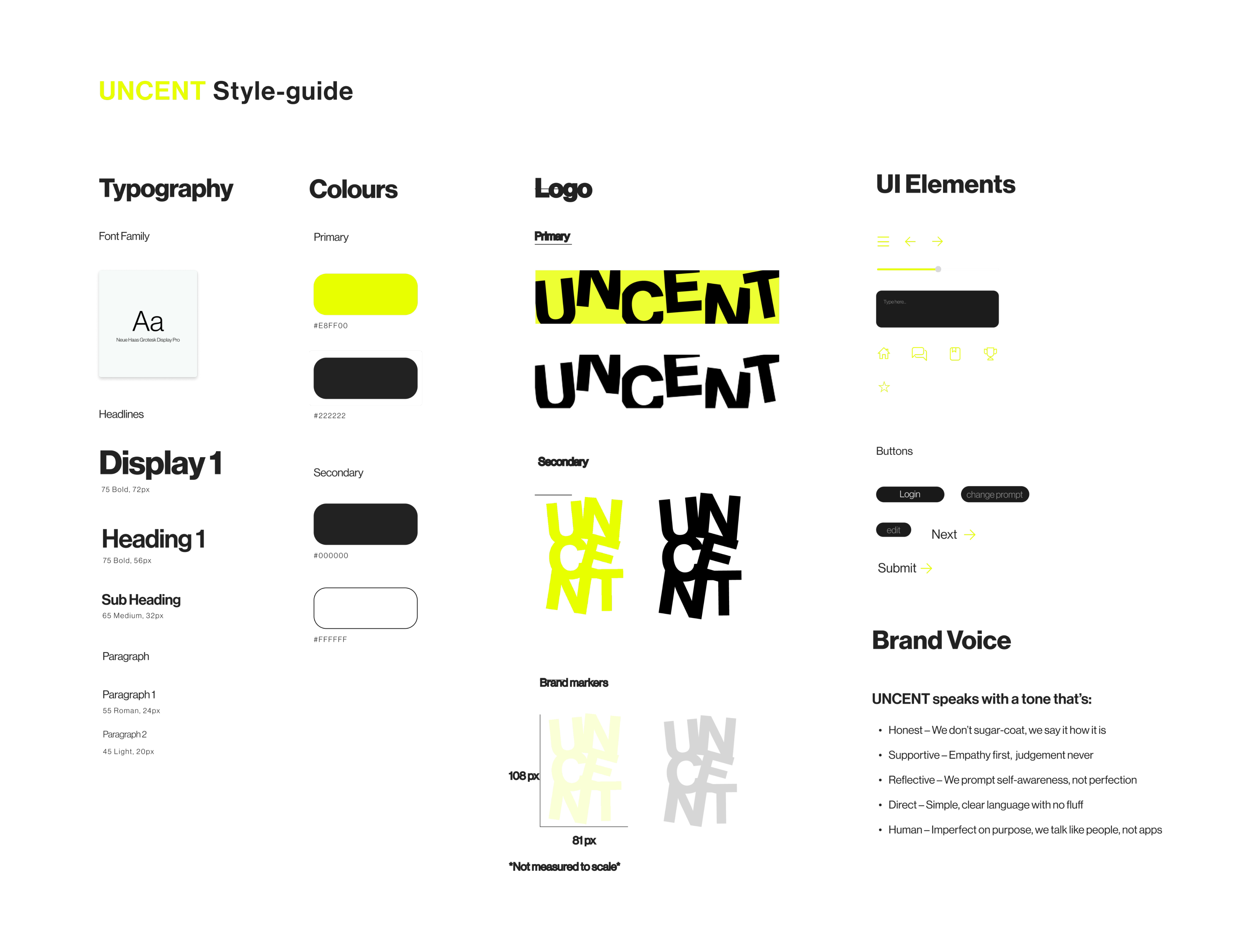
The brand pushed toward high contrast and energy. Chartreuse on black created urgency and confidence without the cold sterility of traditional finance tools.

From rough wireframe through to mid-fidelity and final UI, each iteration refined how information was presented and how the tone shifted from transactional to conversational.

The UI system was built around Neue Haas Grotesk Display Pro across all weights, a Chartreuse and Raisin Black palette, and a tight set of custom nav icons keeping the experience focused and intentional.
Designing the interaction experience for UNCENT meant thinking carefully about how someone might feel opening the app after a bad spending day. Every decision, from how prompts are revealed to how progress is communicated, was made with emotional safety in mind. The goal was to make the platform feel like a personal guide, not a coach, not a bank, just something that helps you get unstuck.

Personal prompts are surfaced one at a time, with no pressure to complete everything. Users can change the prompt if it does not feel right for that day.

A guided chat bot offers a lighter entry point for users who are not ready to journal. It asks simple questions and helps users articulate how they are feeling about money without requiring written responses.
The final outcome is a web-based journaling platform built on three principles: progress focused, personal reflection, and highly adaptable. UNCENT tracks weekly saver totals, celebrates avoided impulse purchases, and surfaces BNPL savings to show users tangible momentum. The platform extended into a transit campaign with the tagline "Not a coach. Not a bank. Just a guide."


Looking ahead, UNCENT has potential to expand into budgeting modules, community threads, and NZ wellbeing partnerships, growing from a personal reflection tool into a broader financial confidence ecosystem.
UNCENT taught me that the most effective design is often the most restrained. Removing friction, removing judgement, and removing pressure created space for something genuinely useful. If I were to continue, I would invest in user testing with real Gen Z participants and refine the journaling prompts based on what actually resonates.