
Project
The Healing Project
Discipline
Brand Design · Graphic · UX
Context
In-patient eating disorder care
Audience
People in in-patient ED treatment
A brand and UX project exploring how design can create emotional safety within eating disorder treatment settings.
My starting point was personal. Having experienced treatment myself, I knew firsthand how clinical environments can strip away a sense of identity, and how absent any human-centred alternative was. That experience became the foundation for the research.
Develop a brand strategy that provides a foundation for creating experiences that support people in eating disorder treatment through a warm, grounded, and non-clinical approach.
Research question
The problem wasn't access to information. It was how that information was delivered.
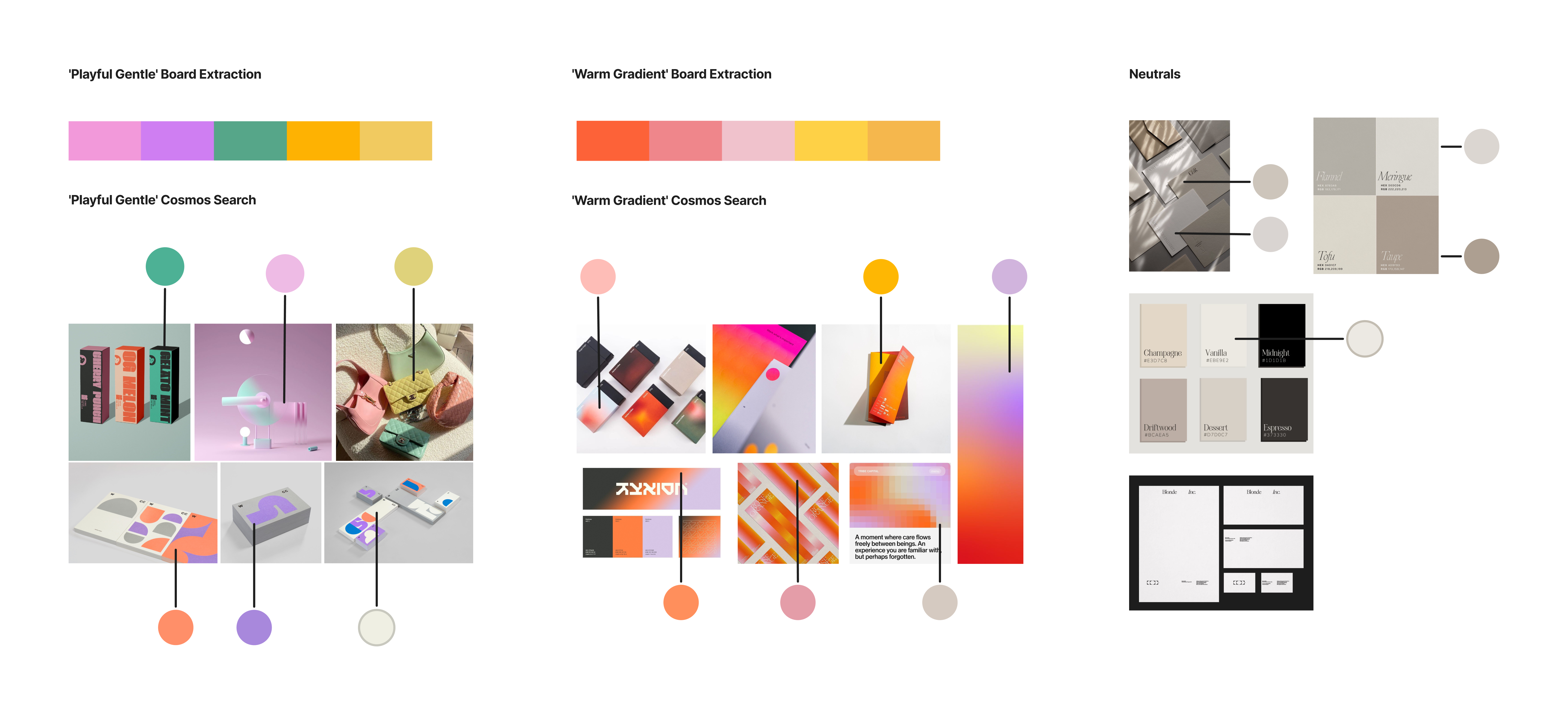
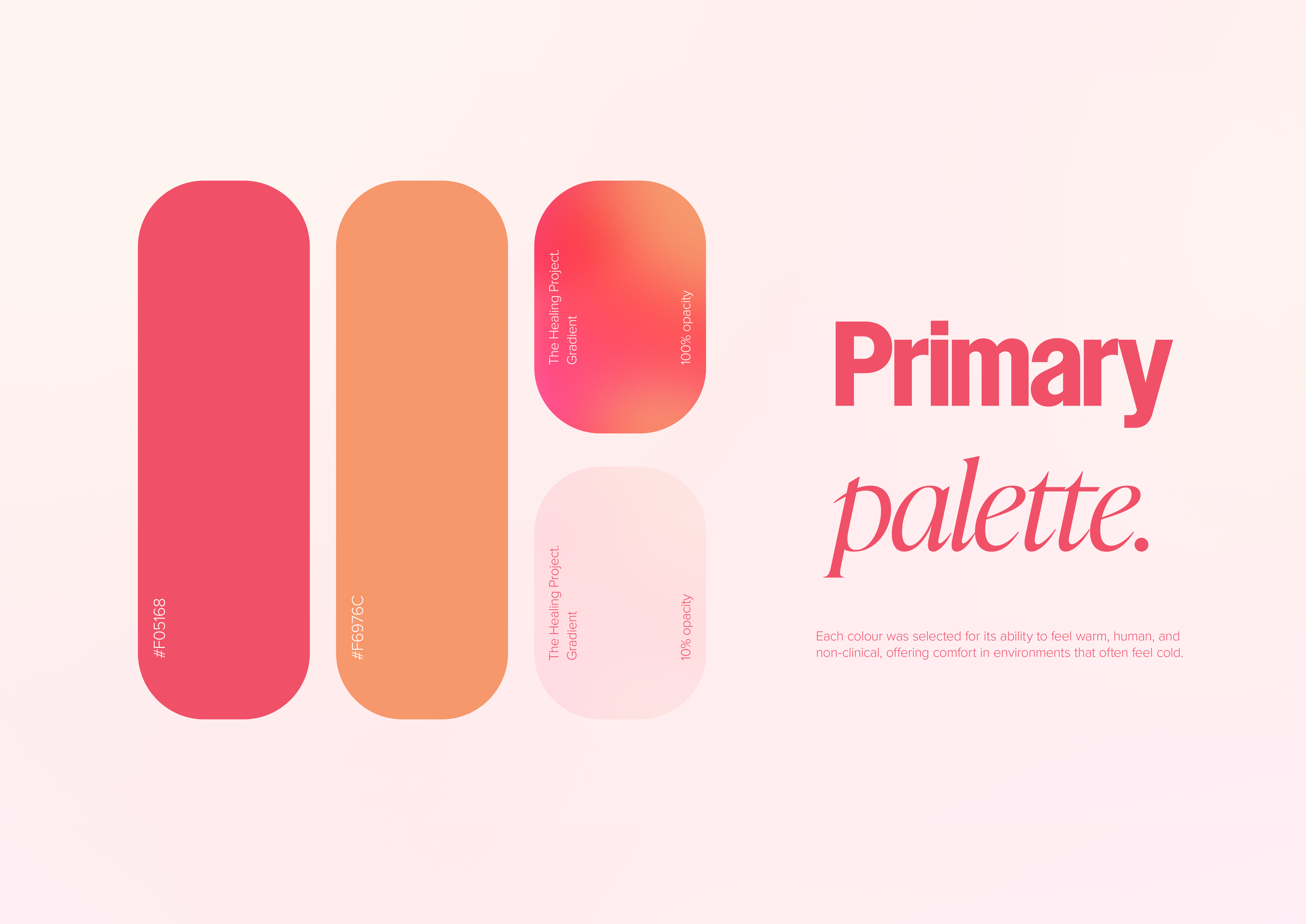
I built moodboards to explore colour directions that felt warm, grounded, and non-clinical, then took the strongest candidates into user testing to see how people actually responded.

Each round of exploration started with the same question: "does this feel clinical to you?" Peer feedback consistently pushed me toward warm neutrals, softer typography, and more organic forms. The turning point was removing rigid grid structures and letting the layout breathe.
Early visual directions felt too rigid, closer to a health brand than a human one. Feedback made it clear the work needed to feel less designed and more felt. Shifting from structured grids to organic, breathing layouts was the single decision that changed everything.
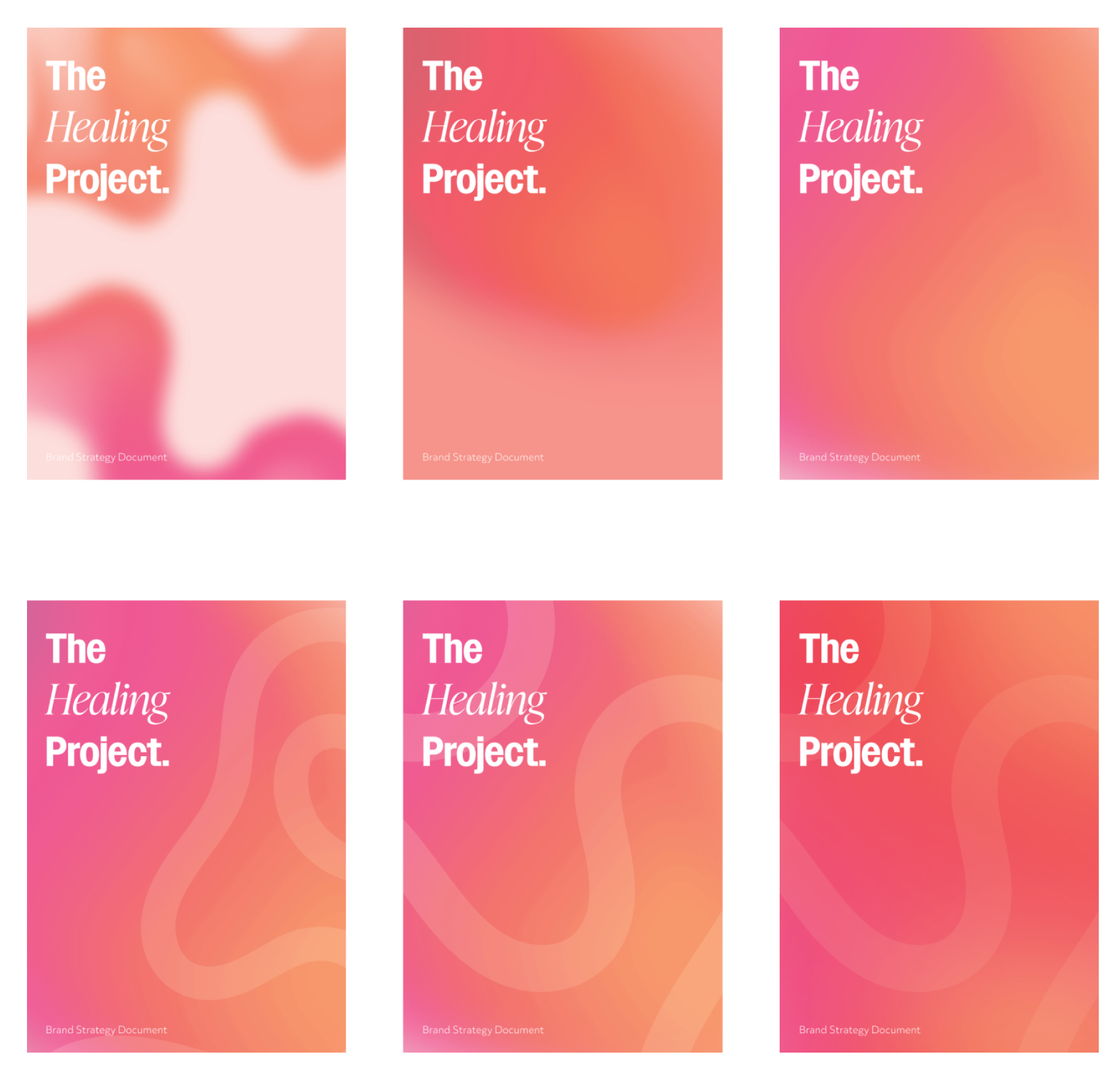
Each iteration brought the design closer to something that felt genuinely human, shifting focus from how it looked to how it would make someone feel.
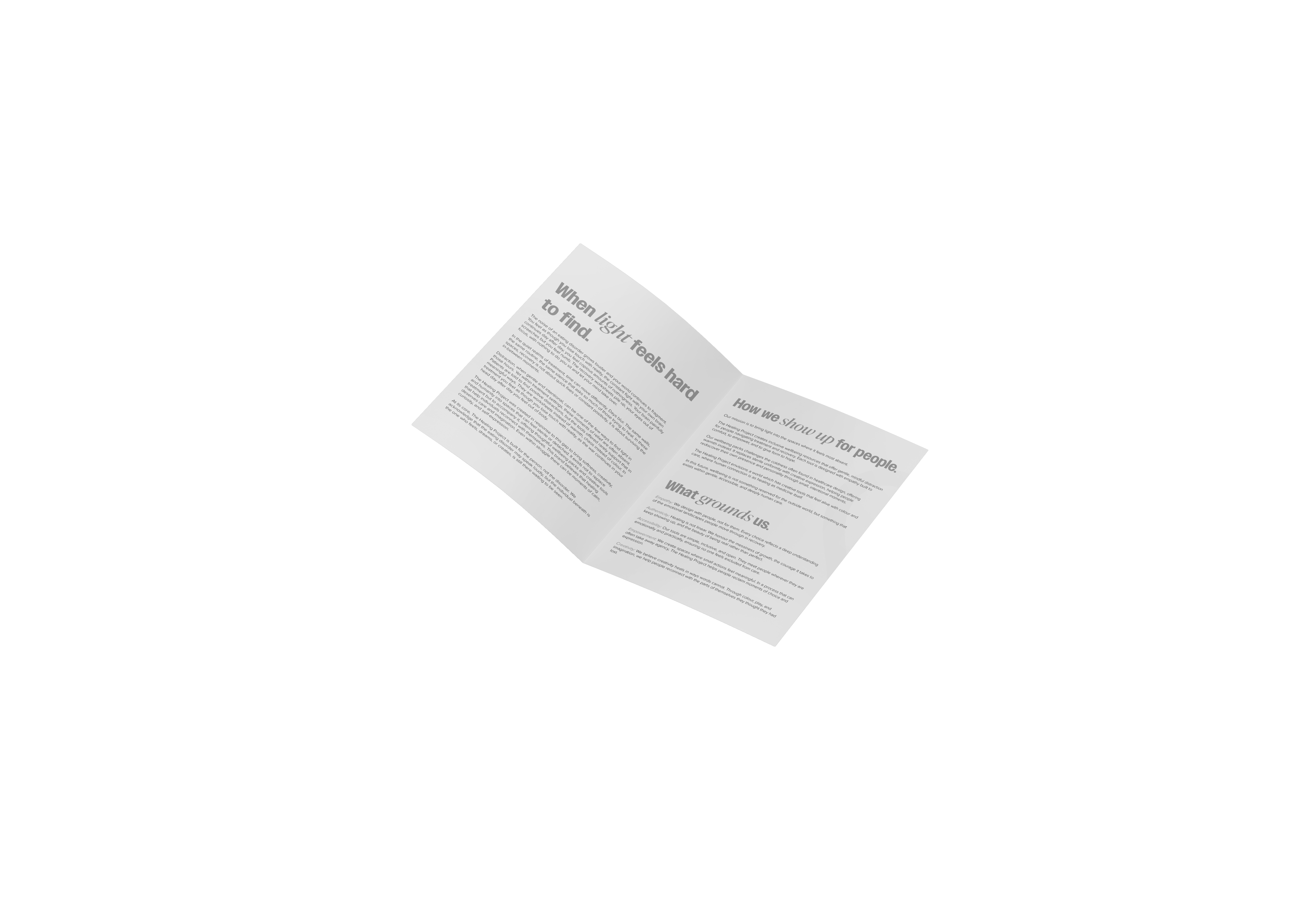
Language was as much a design decision as colour or form. The tone needed to feel warm and conversational without being dismissive of the seriousness of the experience.
Words had to hold space for someone in one of the hardest moments of their life.
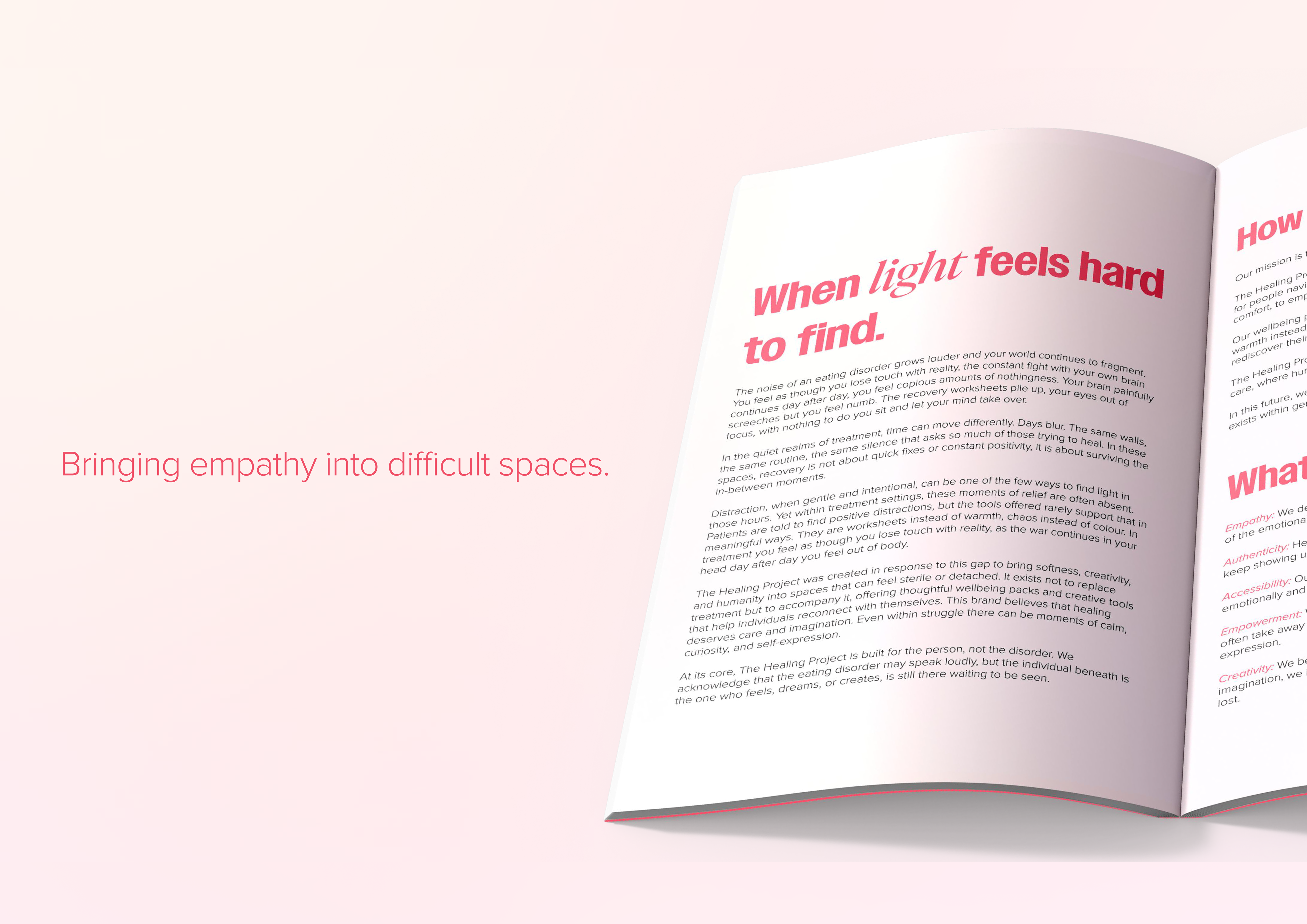
The voice I developed was gentle, grounded, and human, written to feel like it came from someone who understood, not another system processing you.
A brand strategy for non-clinical wellbeing packs designed to support patients during in-patient treatment and give them a sense of identity beyond their diagnosis.
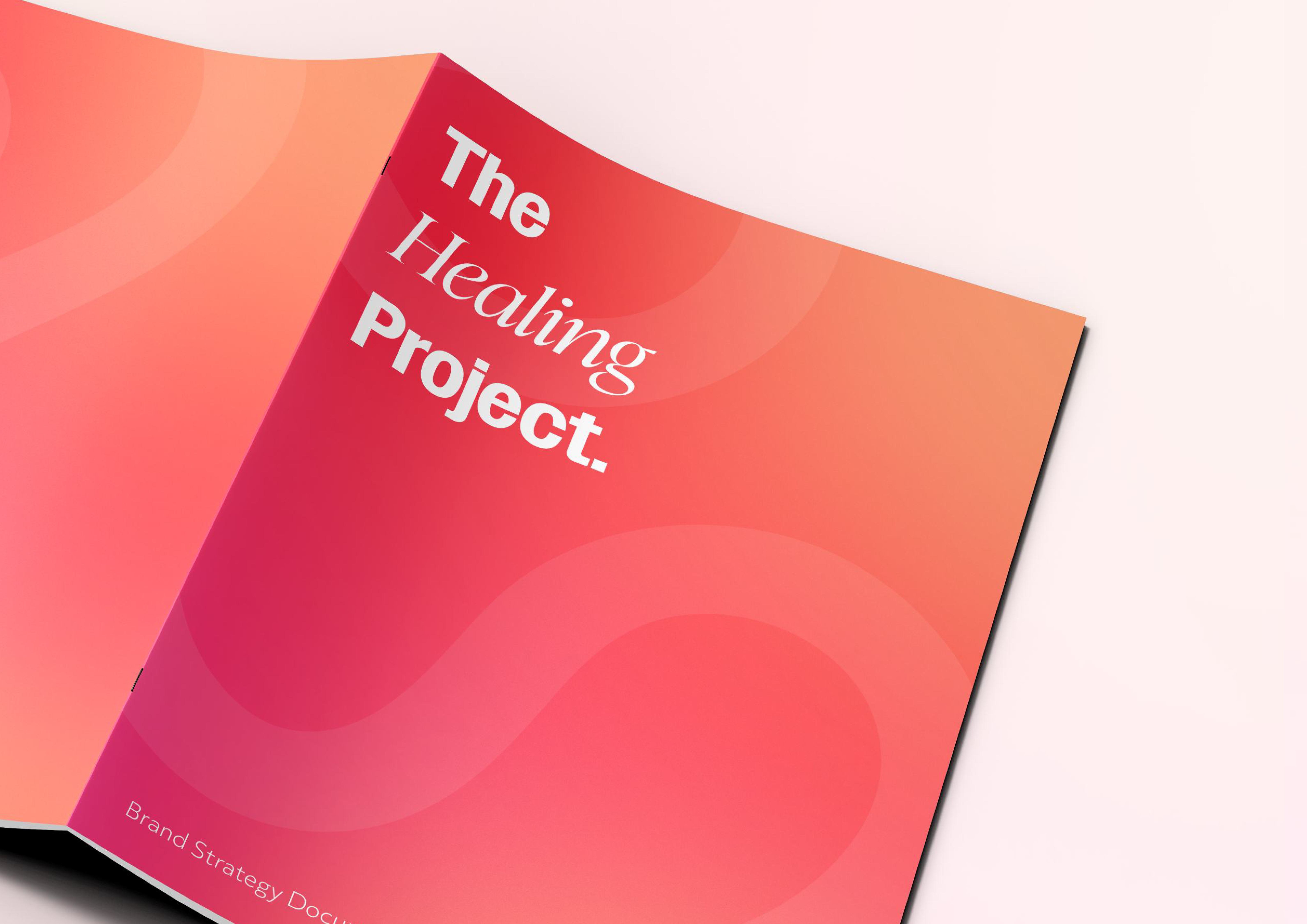
The project showed me that design in sensitive spaces has to earn trust before it can communicate anything. Getting the feeling right was the whole brief.
Because this project was rooted in my own experience, it became much more than a design exercise. It reminded me that design has the ability to make people feel seen, especially during difficult moments. Throughout the process I found myself thinking less about aesthetics and more about how each decision might make someone feel. If I were to continue, I'd spend more time working directly with people who have lived experience to further shape and strengthen the outcome.